
https://ift.tt/NiB2w7J
Design of the UPM Raflatac Label Materials Swatch Book: Transforming a Working Tool into a Tactile, Visual, and Inspiring Experience
Sustainability and sensitivity.
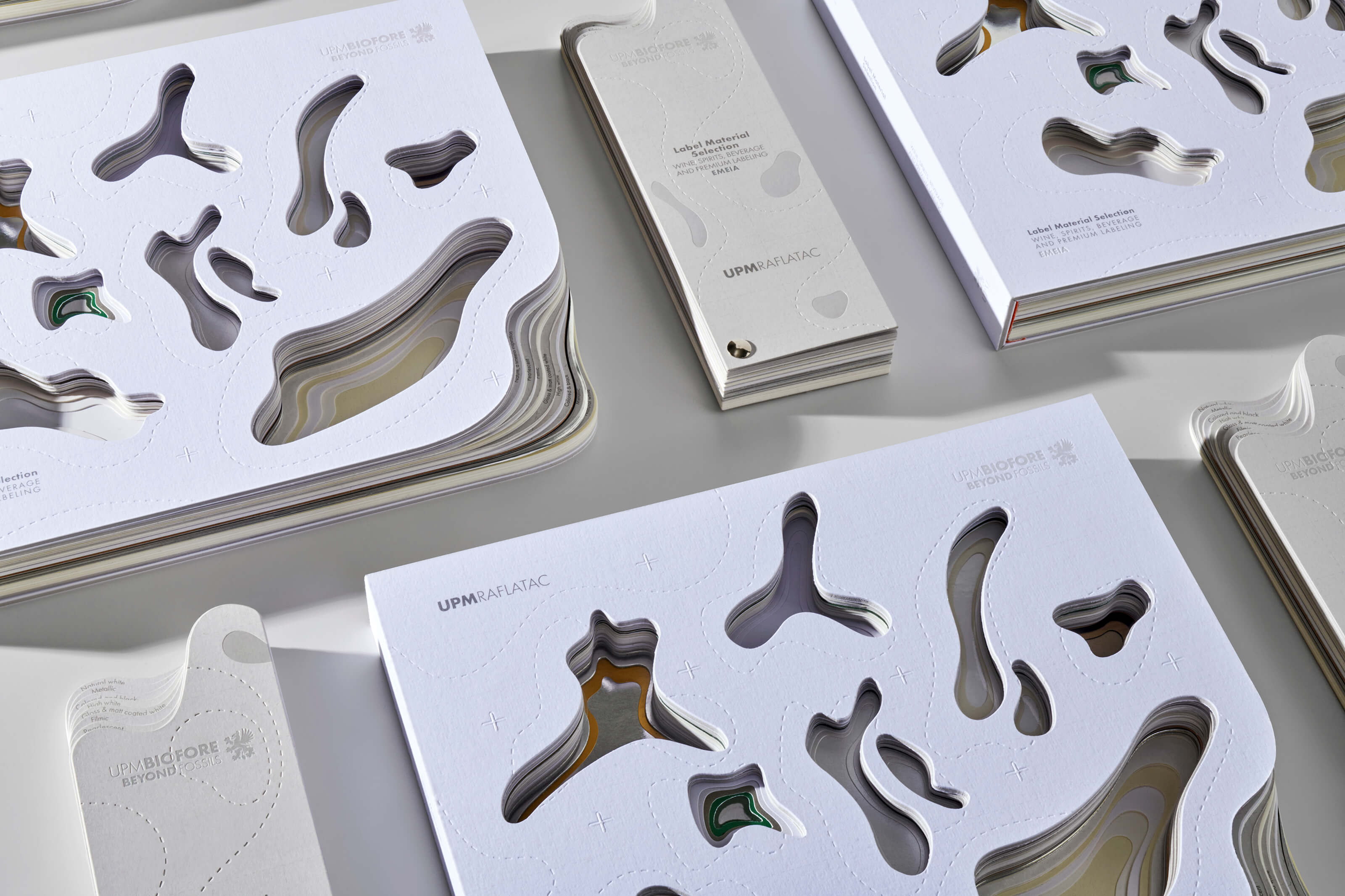
The design of the UPM Raflatac label materials swatchbook seeks to go beyond mere functionality, turning what could be a simple working tool into an immersive experience. This swatch book is not just a collection of paper samples; it is a creation that invites users to explore and connect with the essence of the brand.
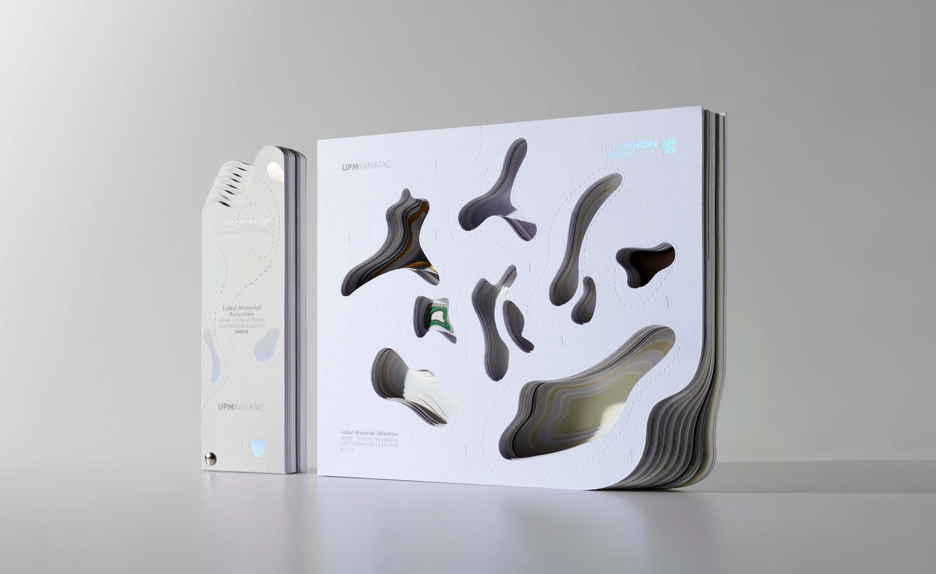
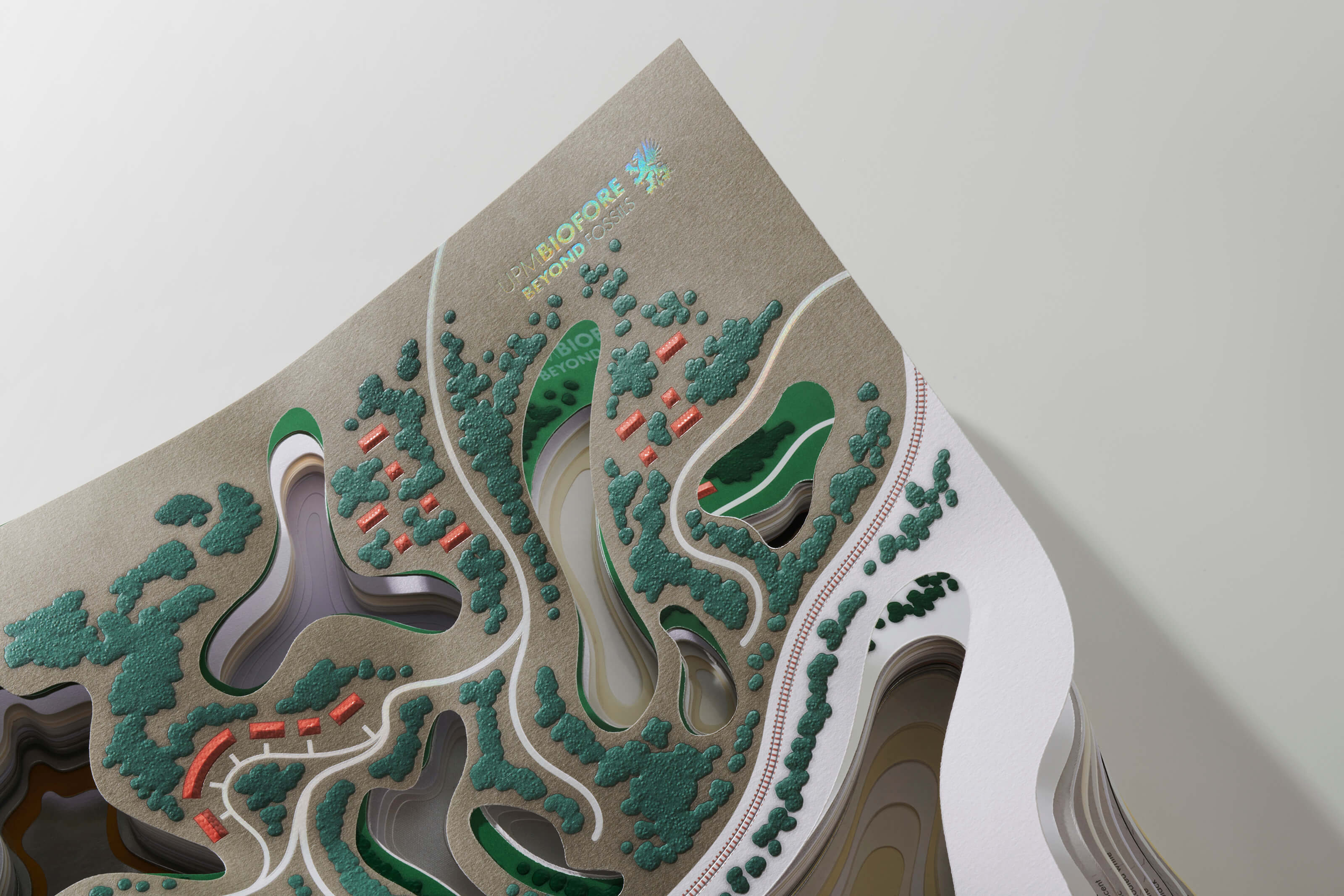
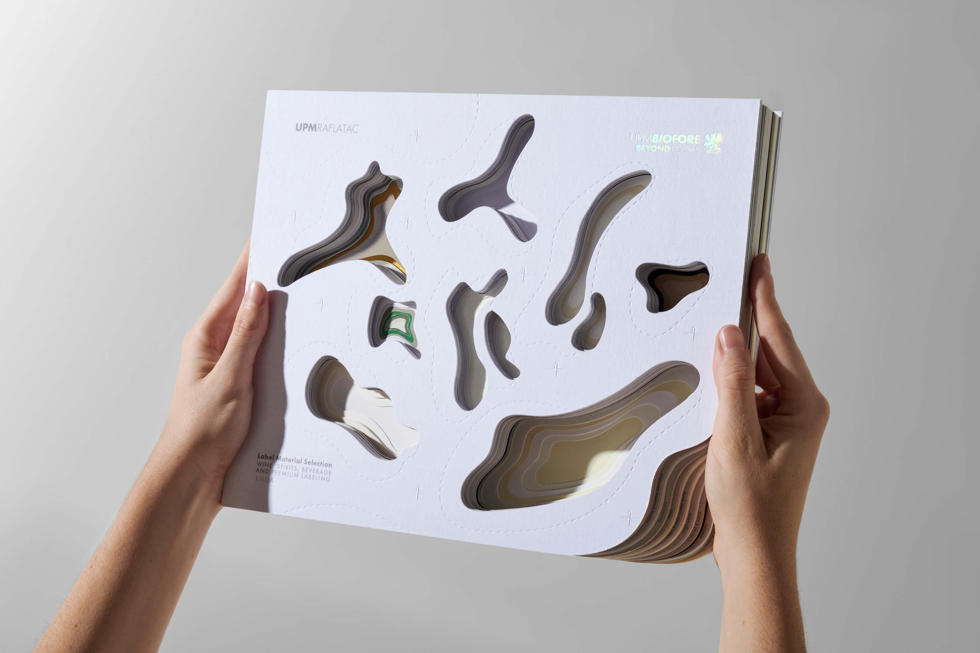
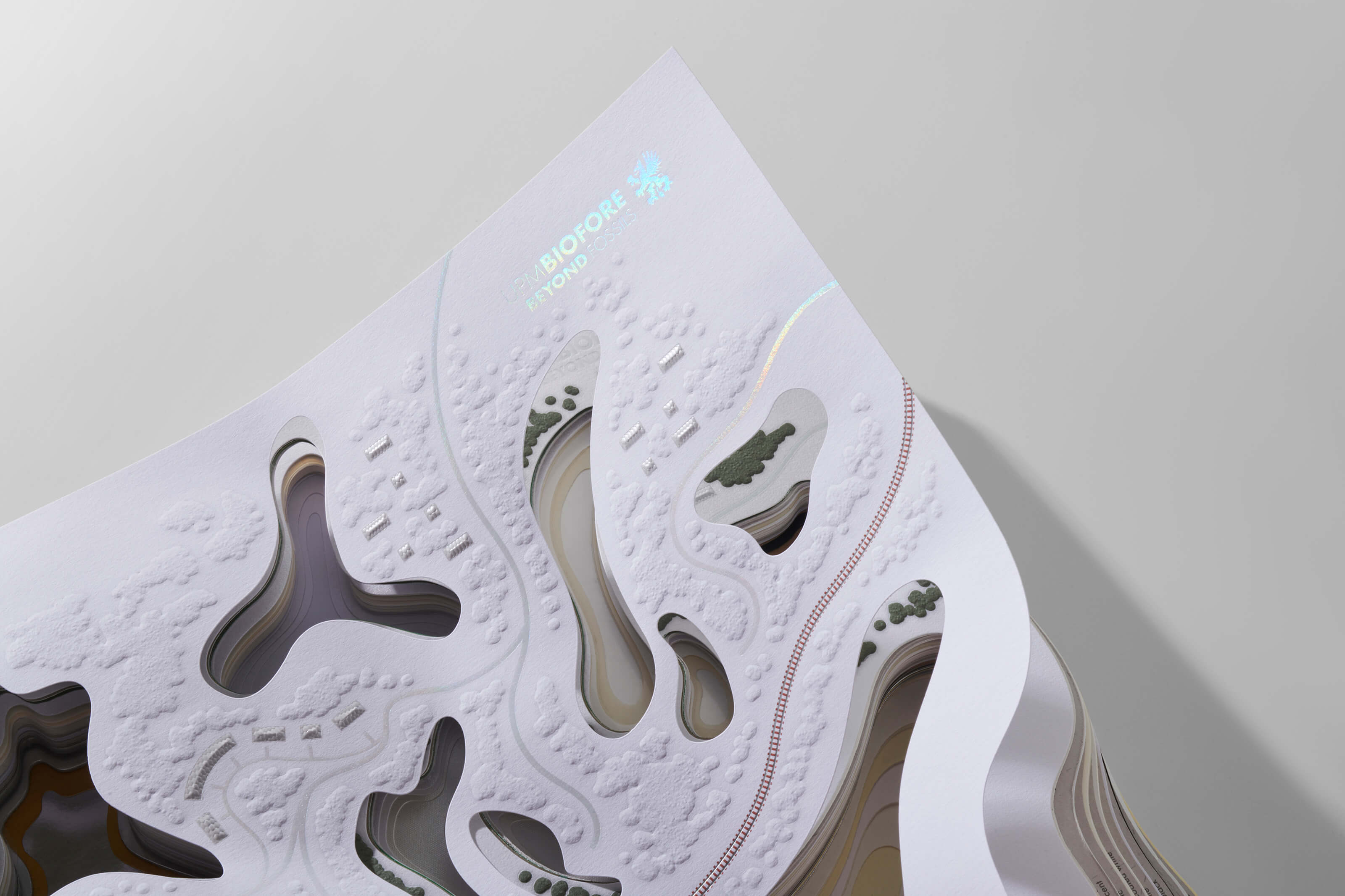
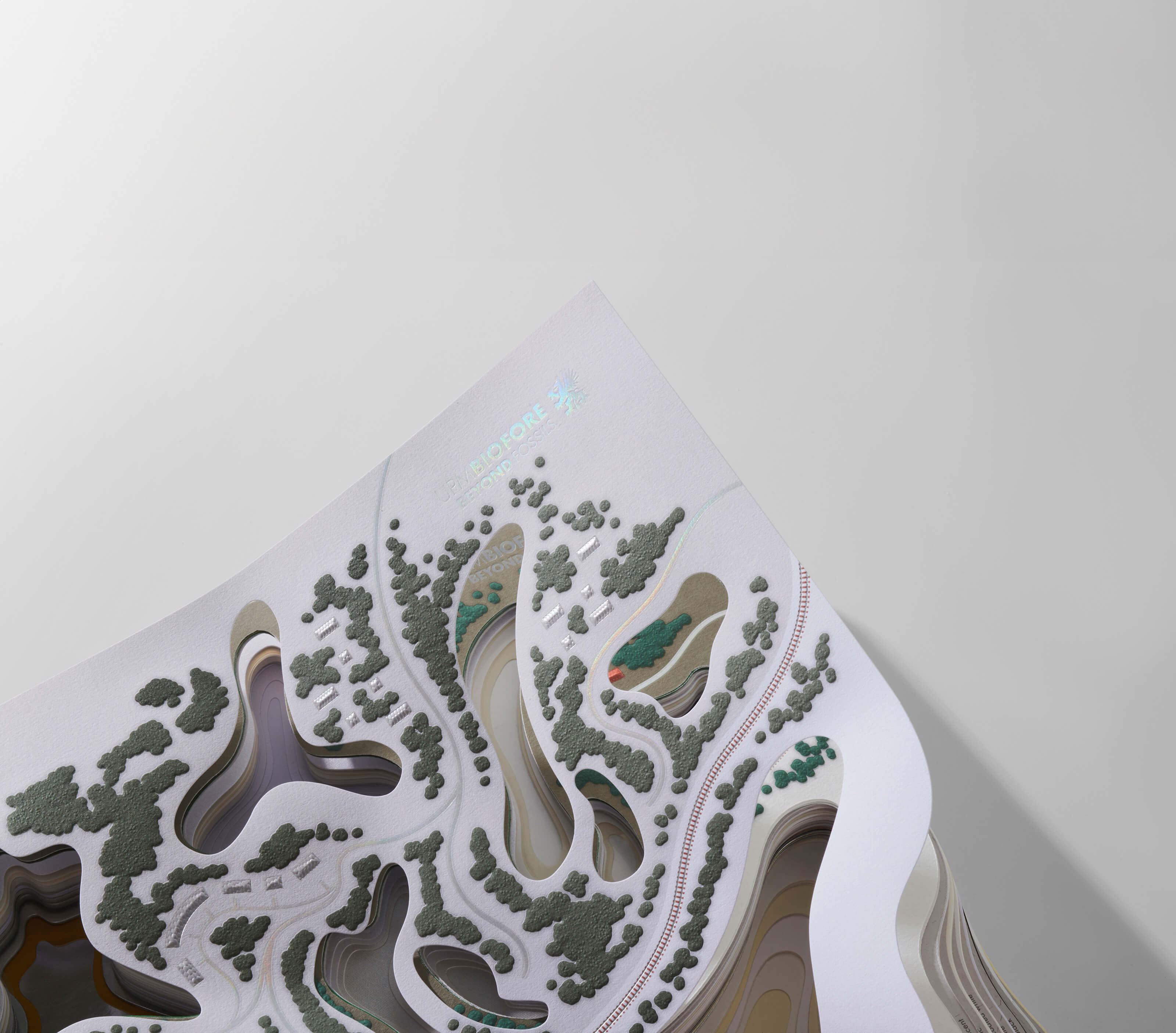
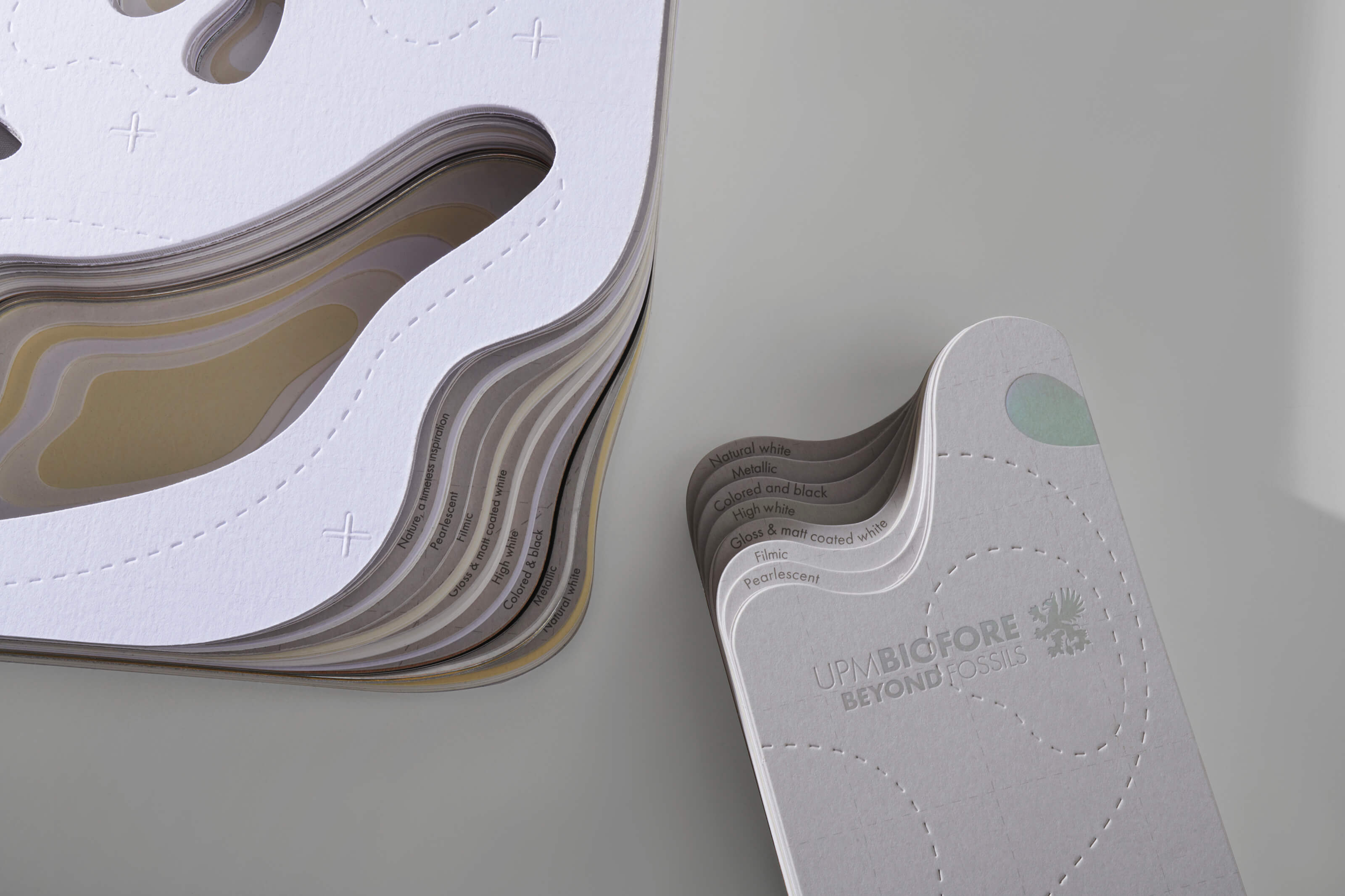
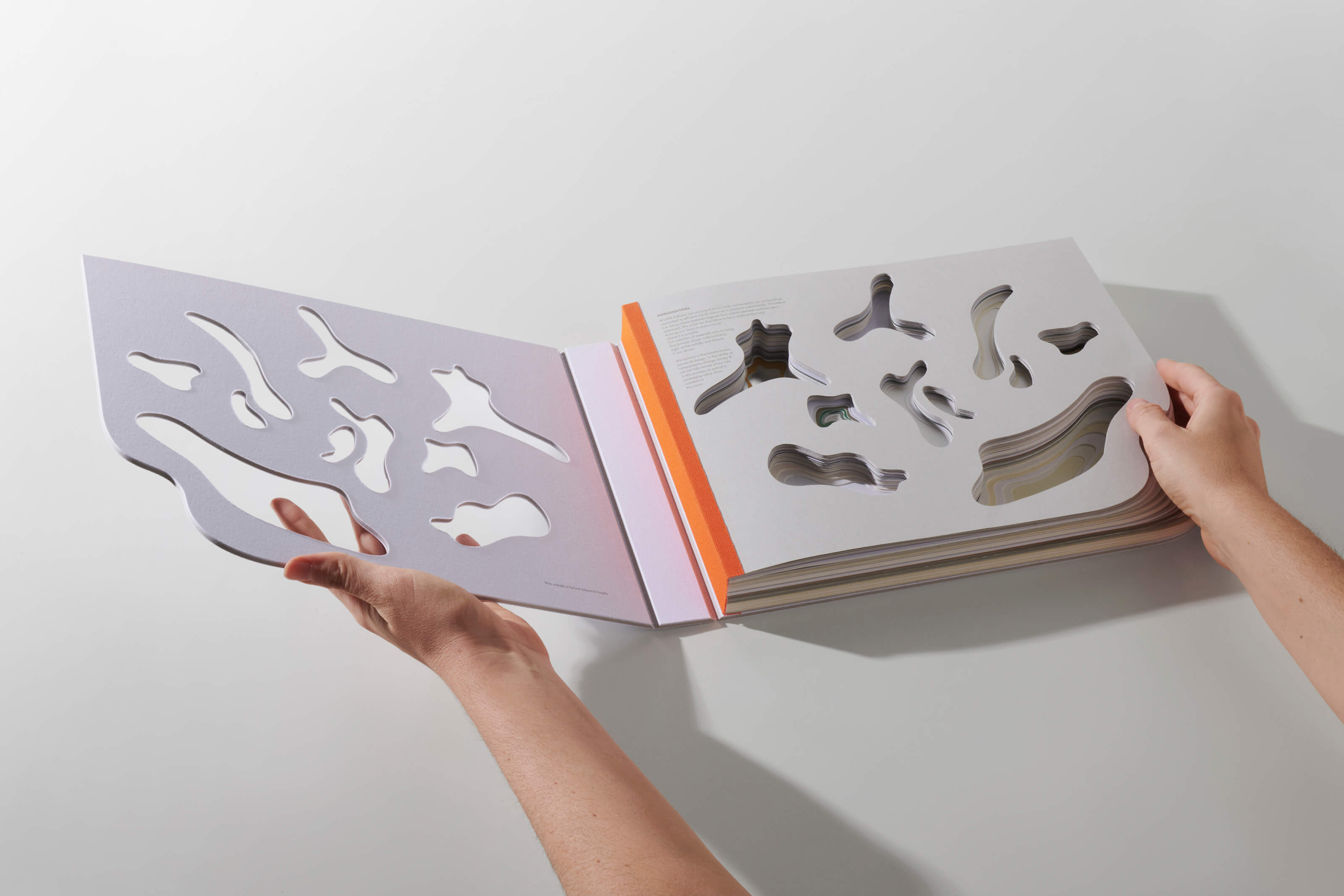
This swatch book is an assemblage of materials that, through its layering, composes an evocative landscape that pays homage to the company’s roots. Finland, a country renowned for its nearly 2000 lakes, inspires this design. The textures presented in perforated layers reflect the richness of this landscape, allowing the Finnish nature to influence the tactile and visual experience of the user.
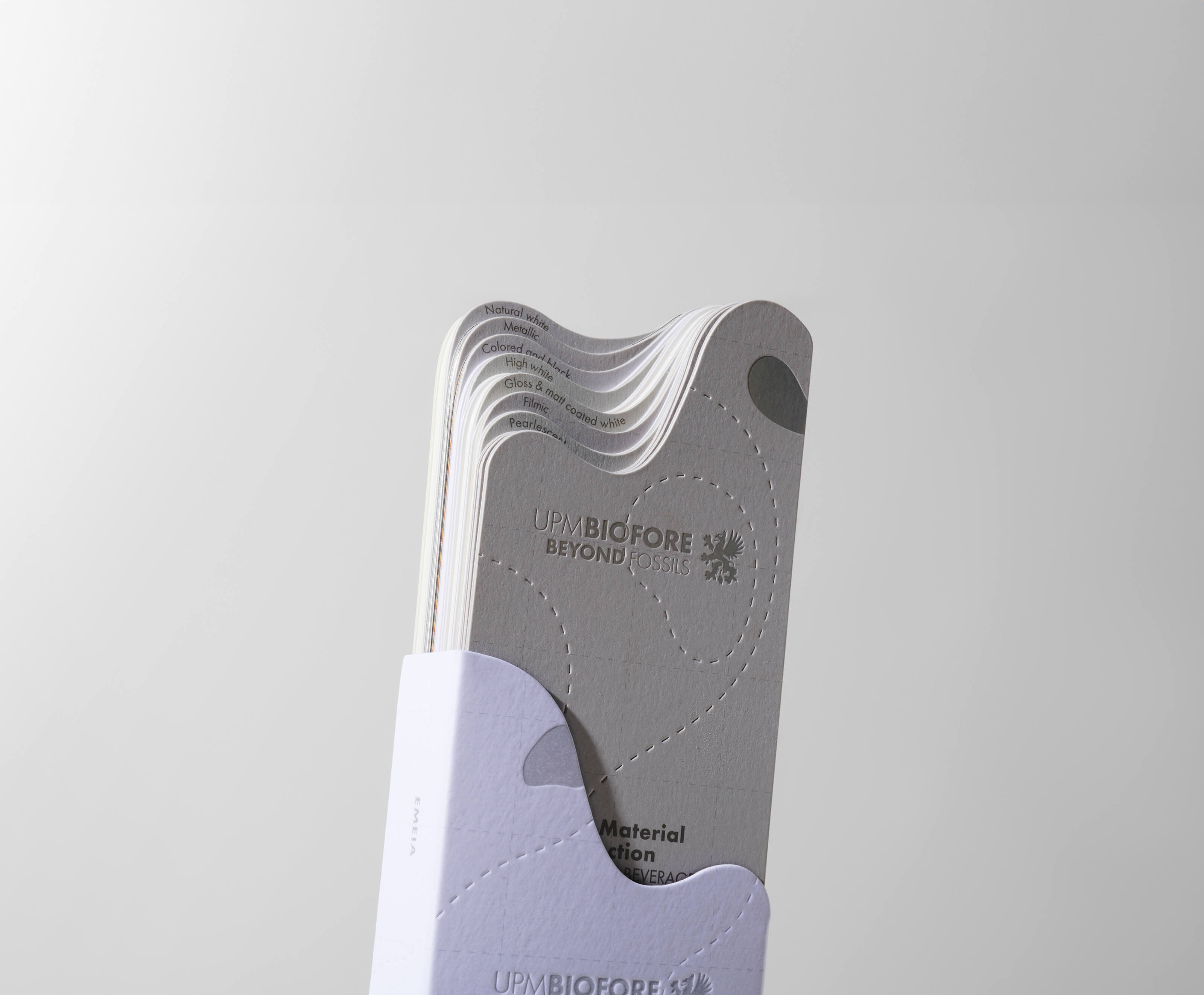
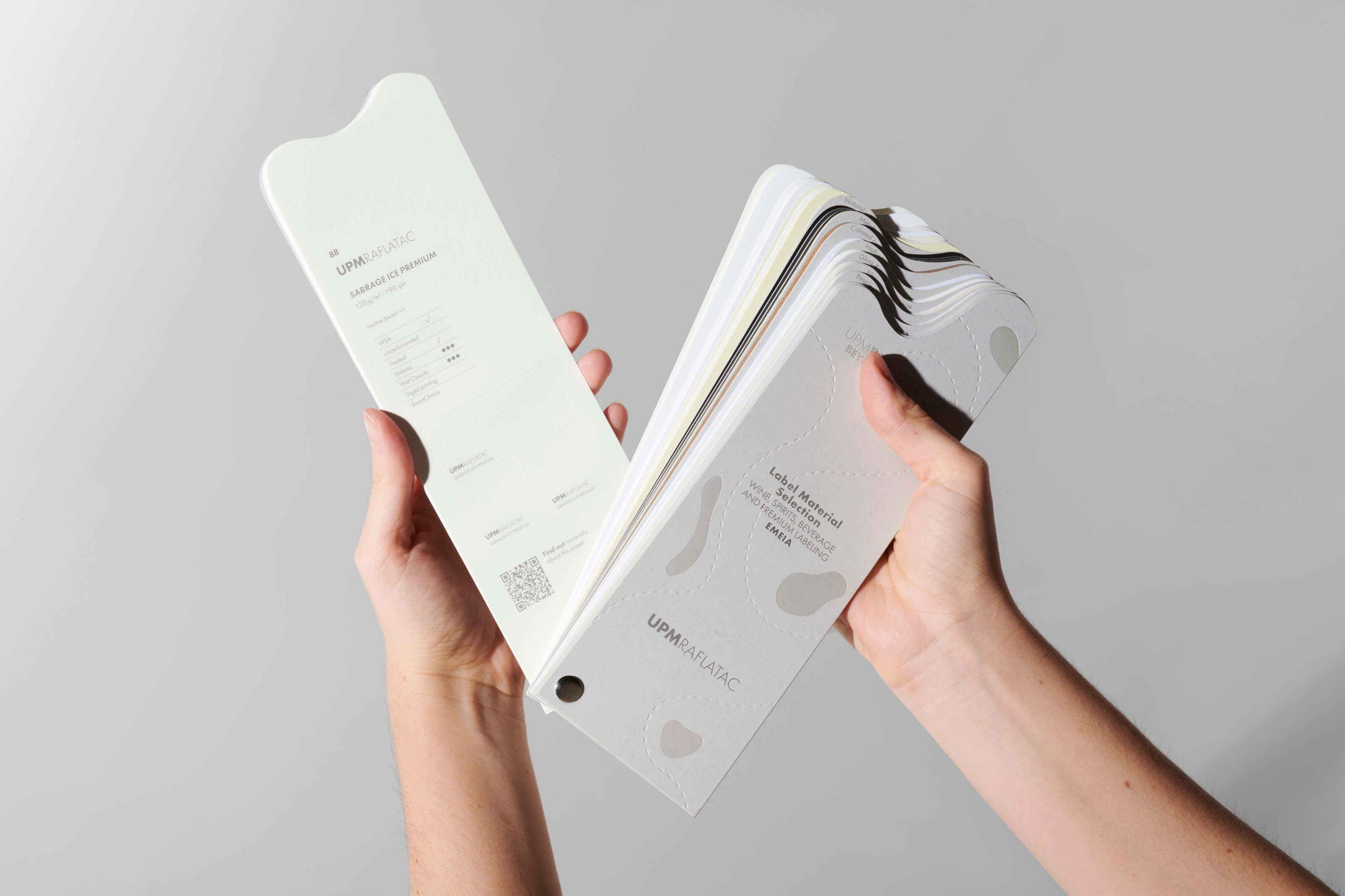
More than just a catalog, this book becomes an object filled with meaning and representation for the brand and its identity. Its structure comprises two interconnected pieces that work in synergy: an overarching piece showcasing all the papers in large, perforated, and illustrated formats, creating a cohesive brand narrative; and a smaller, hand-held piece designed as an essential working tool for designers, printers, and brands.
This approach not only highlights the quality of the materials but also weaves a visual story that invites exploration and creativity. In this way, the UPM Raflatac swatch book becomes a source of inspiration that transcends its initial function, offering an experience that honors the beauty of its origins and the innovation of the brand.
The post Design of the UPM Raflatac Label Materials Swatch Book: Transforming a Working Tool into a Tactile, Visual, and Inspiring Experience appeared first on World Brand Design Society.
February 5, 2025 at 10:48PM
https://ift.tt/8opjcOB
Andrei Sasaran